Have you ever been trying to draw tiles on a wall or on the floor in perspective, but notice that after you’ve drawn them, they don’t look like they’re all the same shape or size?
Well here’s a tutorial on how to fix that.
Your picture probably looks like this, right?
Well, i’m here to tell you how to fix that…Let’s start out with your basics.
The gray line is the horizon line, and the black dot is your horizon line. These are essential for the first steps of perspective. Without these, your perspective may turn out wonky and just not flattering to the eyes. Right now we’ll work in One point perspective.
Now let’s pretend we’ll be drawing a hallway. Draw a vertical line where the edge of the wall is.
Now, from the tips of the bottom and top of your wall, you’re going to need to draw a line extending all the way to the vanishing point. If you’re working in photoshop you could either use the line tool, or shift+click. If traditional, you’ll need to use a ruler.
Now that we have the wall that’s in perspective, it’s time to draw the rest of the lines. here I’ve drawn the wall facing us that’s closest, the ceiling, the floor line, and the end of the hallway. ASSUMING that you are working in one point perspective, all vertical lines are straight and parallel to each other, and all horizontal lines are straight and parallel to each other.
Now here I have erased the lines that extended beyond the back wall, and found the center point of the edge of the left wall. From there, you draw an extended line just as before towards your vanishing point.
now make a vertical line where your first “tile” is.
now this may be a little hard to explain. Now you’re going to draw a line coming from the corner of the wall, through the corner where your line meets the tile you just drew, and all the way to the ground line.
You see where these two lines meet? you’re going to draw a vertical line to the ceiling from here.
Like so!
Now rinse and repeat! you should have perfectly even spaced tiles now! And if you have tiles on the ceiling
Just draw horizontal lines connecting to the vertical lines!
Now just erase anyhing you don’t need and…viola! Perfect tiles in perspective!!
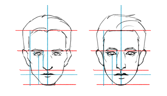
These are the standard proportions of a human head:
When you start tweaking them you get different looking
faces!
You can also take the same proportions and change the shapes
of the features and get a new face as well! Amazing!
So if you want to draw your favorite characters what you can
do is figure out their “facial blueprints” and reference them. Let’s
draw that smarmy bastard Hannibal Lecter. Use as many lines as you need to gauge the spacial relations
between each feature.
What shapes make this face uniquely Hannibal’s?
Let’s apply it all together now.
It takes practice of course but it’s a good way to study the
character’s face! I hope that was somewhat helpful lol Q__Q
this is by no means a comprehensive guide and just covers the most basic structure that i’ve observed. But it was fun to make. Simple styles may look easy but are actually pretty challenging so make it look good xux
MSPA style is really fun to draw, I highly recomend it if you haven’t actually tried it! Papers breakdown is great 😀
i like necks a lot yeh lets talk about necks!!! u gotta know what’s going on in there to draw necks, here’s a fairly simple run down.
Also a lot (most all) of my anatomy knowledge comes from taking Scott Eaton’s anatomy for artists course. If you have a chance/money to take it, it’s really great.
Hey guys! Here’s a post that I hope some will find helpful, things I have picked up along the way that I wish I had known from the start! These are not set in stone, and only just suggestions, I’m no expert okay guys
THINGS I WISH I HAD KNOWN ABOUT PHOTOSHOP:
1. FLOW. Flow was put in place primarily for the airbrush folks. Now its relevance has changed slightly. With textured brushes, try reducing the flow to “expose” texture. 2. Ctrl+U : HUE/SATURATION/LIGHTNESS. For people who are indecisive about color, use this to slide around the color quickly instead of repainting or replacing the color. 3. CLIPPING/ LAYER MASKS. Seriously, take five minutes to do this. A good online resource is ctrlpaint. This will be instrumental in creating hard edges, something beginner digital artists really struggle with. Also non-destructive, you will save SO much time. 4. With that said, ctrl+alt+g makes the current layer you are on a clipping mask. You can layer mask a group. 5. MULTIPLY and the surrounding layer types in its little section is like a dark glaze. Good for shadows. 6. OVERLAY and the surrounding layer types in its little section is like a lightening glaze. Good for lighting. LIGHTEN and the dudes around him are also good for lighting, esp. screen. 7. MAKE YOUR GOSH DARN BACKGROUND IN THE INTERFACE LIGHTER. Your contrast will thank you. Right click on the background of the interface and choose the one you like the best. I know dark grey looks sexy, I know. 8. TRANSFORM TOOLS ARE THE BEST (but paint over them). If you have a tile, pattern, whatever- Image>transform> choose your weapon. Have a tiled floor? Don’t you dare paint all those tiles. Scales? Paint them flat in a square, then use the warp tool to push them around the form. Then make your painterly adjustments. 9. PAINTING SHORTCUTS: Numbers affect the opacity. Shift+ Number affects the flow. Holding down alt gives you the eyedropper. Brackets [] change size of brush, these dudes <> cycle between your brushes. 10. HISTOGRAM. If you have a fairly even histogram, this means your distribution of lights mids and darks is even. If it is skewed, and you don’t mean it to be, adjust accordingly.
Just be casual about it and love your art I love you all
drawmaevedraw.tumblr.com
I hope you don’t mind if I add onto this!!
11. CHANGE YOUR HISTORY STATES. Go to Edit>Preferences>Performance. See where it says history states? Set that to around 200-400. This effects how many things you can undo before you run out of… well, undo’s. When you’re painting, you’ll hit this quickly with all the little strokes so you’ll thank me later.
12. CLIPPING/LAYER MASKS. In addition to what maeve said above, you can also apply clipping masks to groups. VERY HELPFUL. I personally put all of my base color in a group with a layer mask, then I add my shading layer above the group and clipping-mask it to the group. It will not show anything outside the layer mask in the group! Pretty handy :3c
13. SET UP AUTOSAVE. Yes, photoshop CS6 comes with an autosave feature, USE IT.. You can set it to save your progress every 5min up to an hour. I have mine set to every 10min. It will not overwrite your current save file, but if photoshop crashes and you open it again, it’ll pull up the last few files you were making changes to. You will have to RE-SAVE these files to keep your changes. It’s a sanity-saving tool to have enabled. Autosave will not work if your computer shuts down, only if photoshop crashes.
14. You can make your layers different colors in the layer menu. Just right click on a layer and choose the color. You can change them to red, green, violet, orange, yellow, blue, and gray. This is very helpful when you want to keep things organized. Naming your layers is also a very good thing to get into the habit of, otherwise you end up clicking a layer on and off to try and find the one you are looking for.
1. Lock Transparent Pixels. This means you cannot color anything outside of what you already have on the layer. Your opacity will also not change. VERY useful for when you have to recolor something. [this is why I keep almost every color on its own layer, for easy recoloring.] This is probably one of my most-used tools.
2. Lock Image Pixels: Makes it so you can’t use a brush or eraser on that layer. You can still move it around, transform it, etc. but you cannot add things with the brush tool. Handy!
3. Lock position: You can’t move the layer. You can do other stuff like brush tool, but you cannot move anything in it.
4. Lock layer. You can’t do anything to it. You can’t merge it with anything, use the brush tool, and if it’s in a group, you cannot merge the group until the layer is unlocked. I’ve accidentally done this a couple of times, so if your layers aren’t merging, double check to see if any of them are locked.
With these tools, if you have a lot of layers you want to transparency or brush lock, you can select multiple layers by holding down shift + select layers, or ctrl+ select layers [lets you pick and choose multiple layers] then select whatever lock layer tool you want to use and it’ll apply it to all selected layers.
SO YOU WANNA DRAW CATS AND DOGS BUT THOSE PESKY SNOOTS GET IN THE WAY
Here’s a hopefully helpful tutorial on how to draw them from memory but it also helps to understand and break down how to see their structure when you use reference!
Remember, it’s always best to learn the anatomy of an animal first before trying to stylize it. This way you know the rules and can choose which ones to break!
Please do not repost this tutorial or any images from it. Permission will not be granted. You may post a link to this post instead to help spread it from the original source.
this is by no means a comprehensive guide and just covers the most basic structure that i’ve observed. But it was fun to make. Simple styles may look easy but are actually pretty challenging so make it look good xux
MSPA style is really fun to draw, I highly recomend it if you haven’t actually tried it! Papers breakdown is great 😀
People often say to me: “You draw like some kind of inhuman machine. If I eat your brain, will I gain your power?” The answer is yes, but there is another way.
The key to precise drawing is building up muscle memory so that your arm/hand/fingers do the things you want them to do when you want them to do them. Teaching yourself to draw a straight line or to make sweet curves is just a matter of practice and there are some exercises you can do to help improve.
If you’re going to be doodling in class or during meetings anyway, why not put that time to good use?